
Vulture on iPhone Duo, closed and open
Closed, iPhone Duo runs Vulture as a phone. Open, it gets the layout of a tablet, with the sidebar beside your flights and room for the gallery and the wider scoreboards. Here is what changes when you open it, and what does not yet.
iPhone Duo is two sizes of device in one pocket, and an app has to decide what to do with that. Vulture's answer is that it never asks which device it is running on. Every list and every map lays itself out from the size of the window it has been given, so the phone you close and the phone you open get different layouts without either of them being a special case.
That rule was already there for the iPad, where a window can be dragged down to a narrow column, and for the Mac. The Duo is the same rule on a hinge.
Closed: the phone you know
Closed, the Duo gives Vulture a phone-sized window, and you get the phone's layout. The sidebar is the first screen, a list pushes onto it, and the search field sits in the bar at the bottom where a thumb reaches it. A flight opens as the map with its graph underneath, and Soaring Spot shows a competition's days as rows.
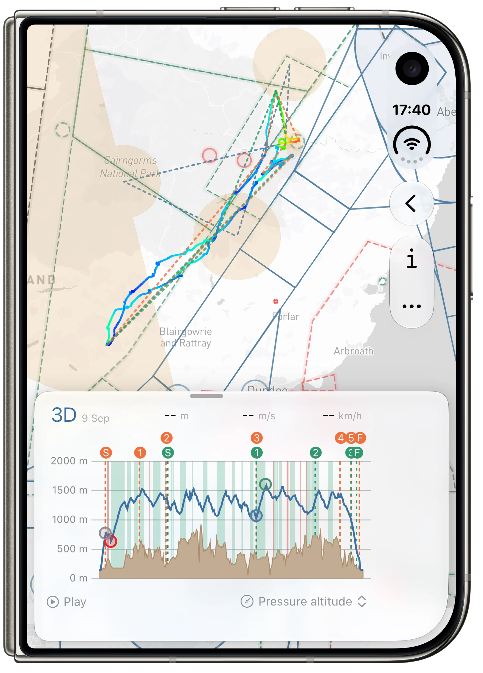
Nothing here is new, which is the point. One-handed at the launch point, it is the app you already use.
Open: the layout of a tablet
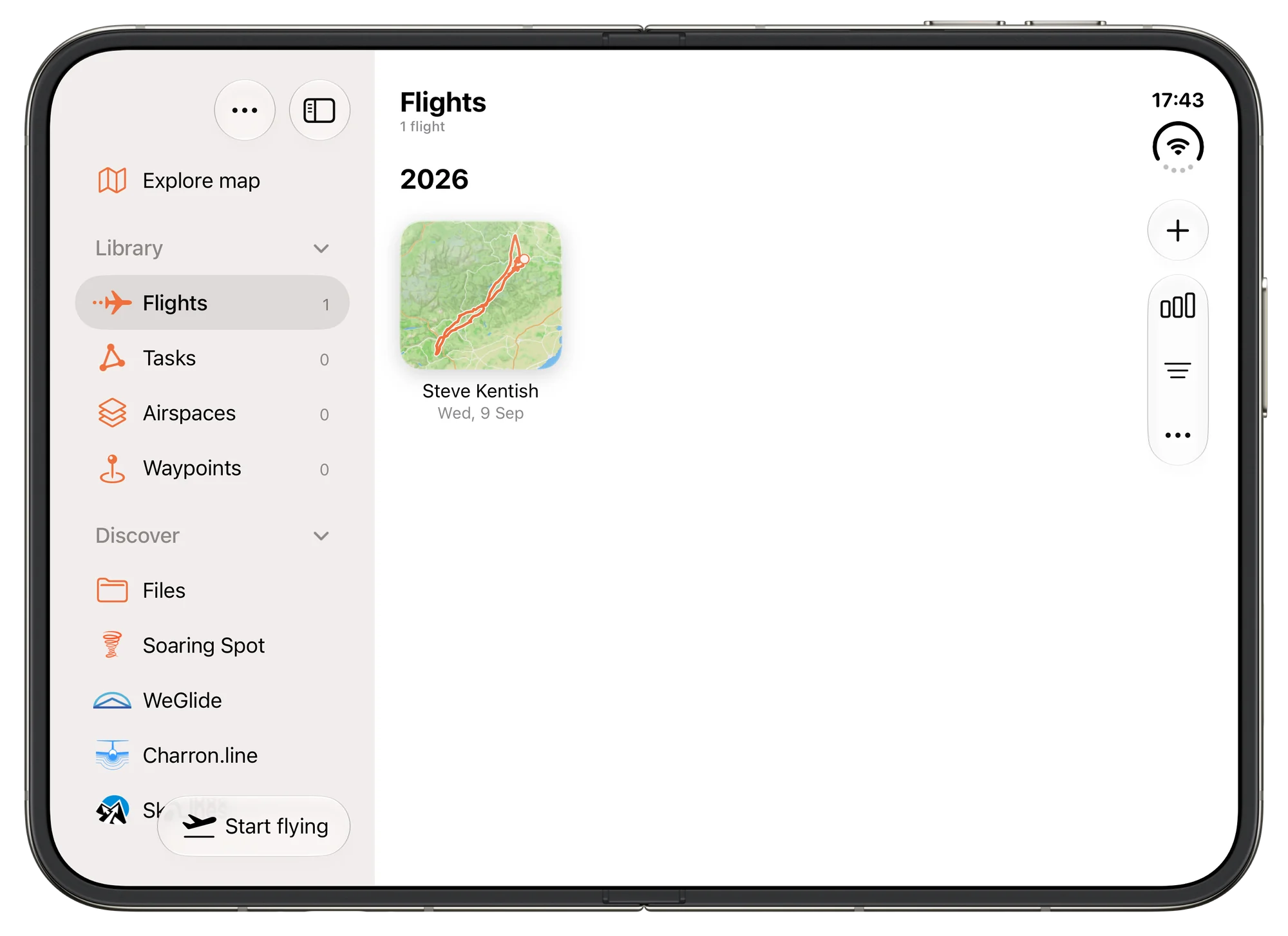
Open it and the window is the size of a tablet's, so Vulture lays out the way it does on an iPad. The sidebar stays beside whatever you open, with your flights, tasks, airspace and waypoint files under Library and Soaring Spot, WeGlide, Charron.line and SkyLines under Discover. The lists have the room to be a gallery, each flight a card with its track drawn over a map of where it went.
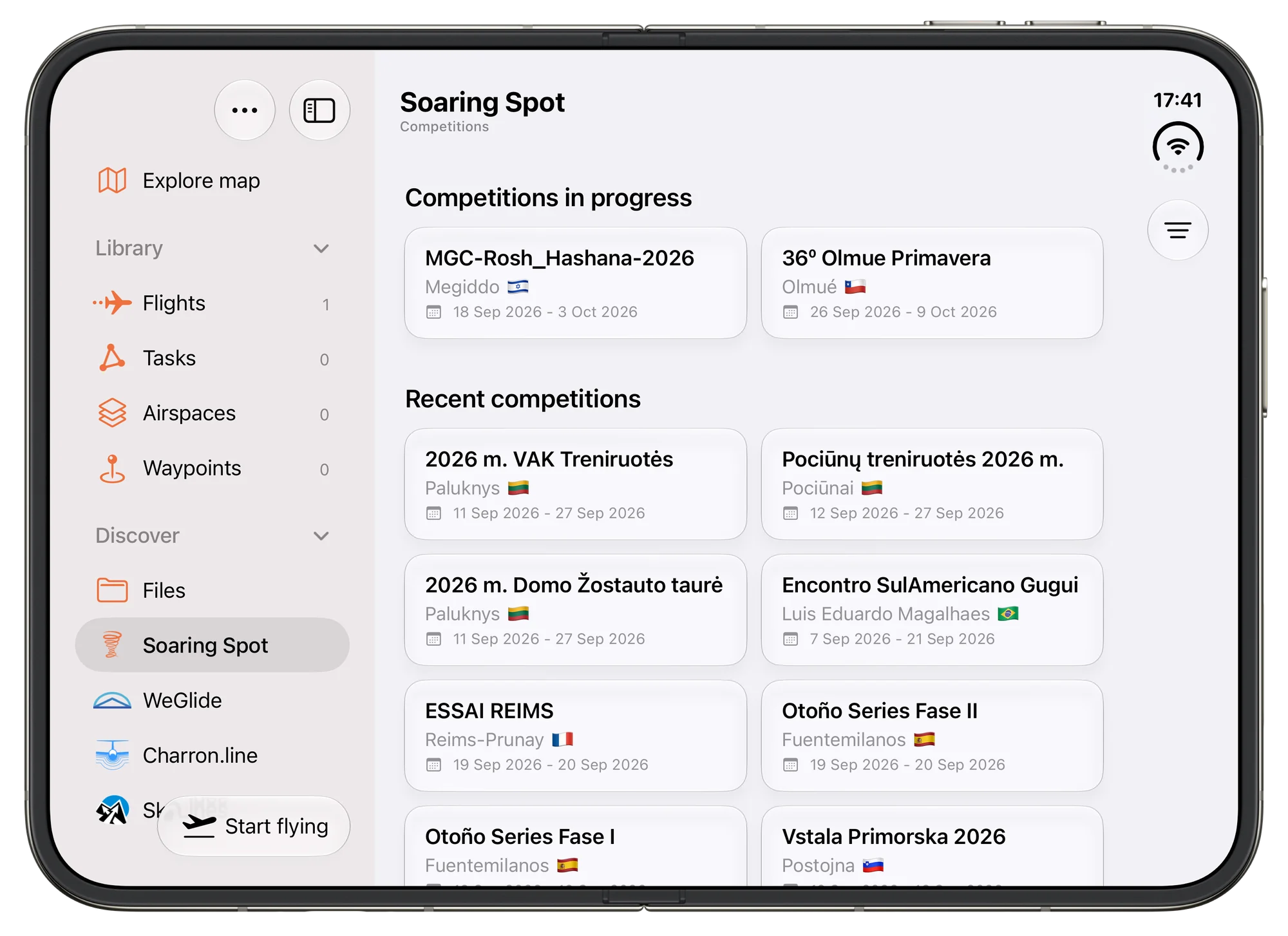
The services use the width too. Soaring Spot shows its competitions and a competition's days as tiles instead of rows, and with the phone on its side a day's results put the speed and the distance in columns of their own beside the points.
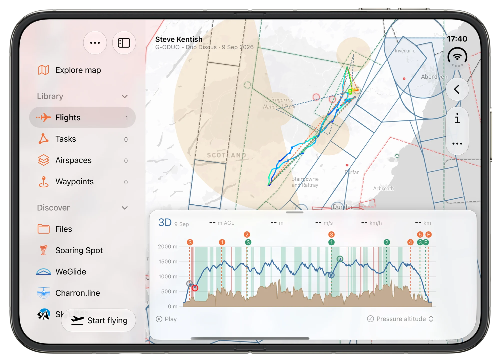
On a flight, the map gets most of the display and the graph, the airspace profile and the thermal sheet float over it as cards. That is where the larger display earns its keep: a debrief at the airfield with the whole task on the map and the barograph still readable under it.
Opening it in the middle of something
Opening the phone does not send you back to the start. You stay on the flight, the task or the list you were on, with the list you came from still behind it.
The map is framed again for the shape it now has. A flight or a task that was framed above the graph is framed again in the room the new window leaves, as large as fits there. A map you had moved yourself keeps its zoom and the place you were looking at. Closing the phone again brings back the view you had.
On its side
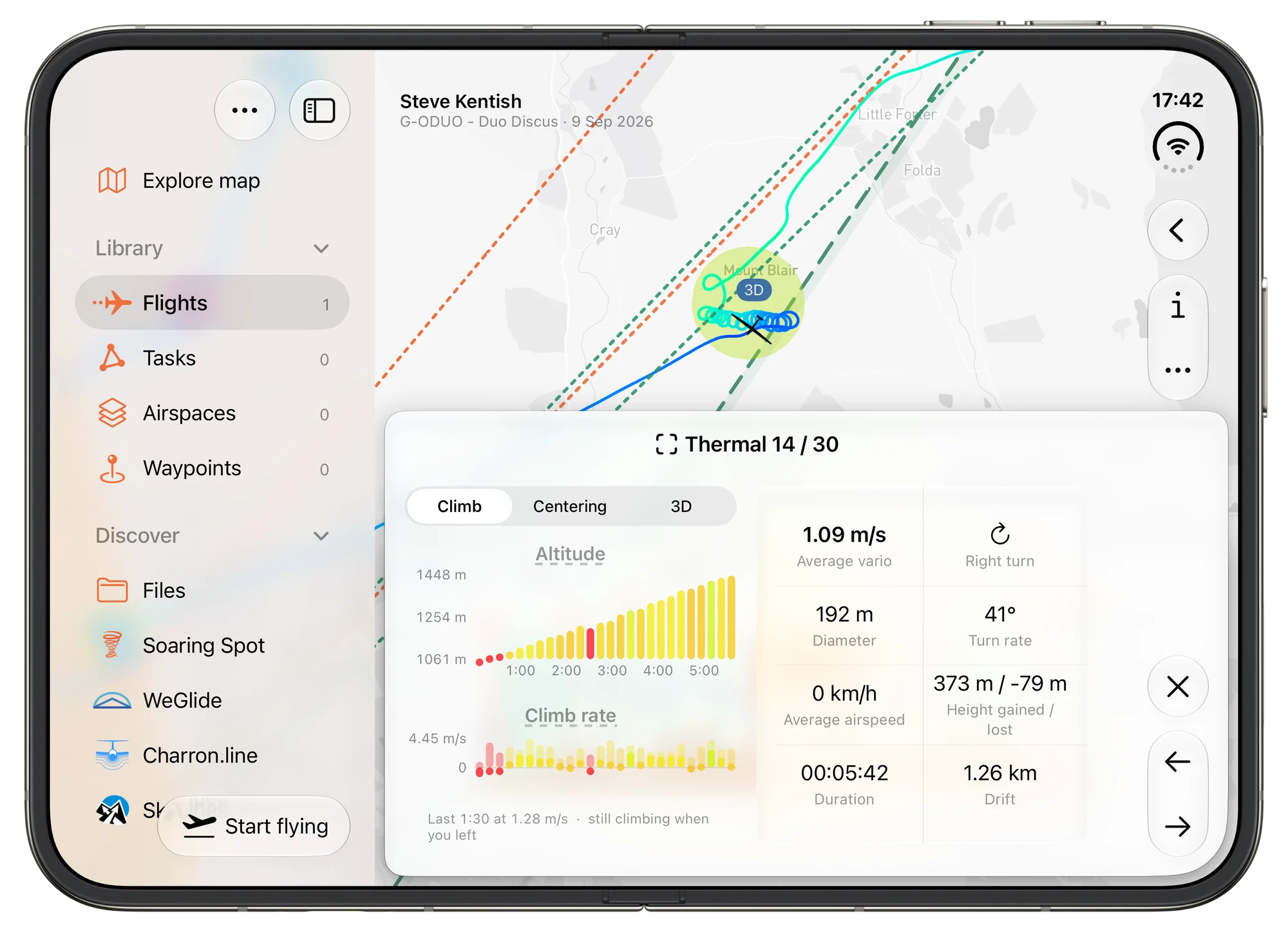
An open Duo on its side is wide and not very tall, which is hard on anything that stacks. The thermal sheet is the case that needed work: its two climb graphs, the view from above and the captions under them now have the height they need there, where at first only their headings were left.
What it does not do yet
Three limits, so you know what you are getting.
Vulture does not lay anything out around the fold. Nothing is placed on one half and something else on the other.
The cover display is not used as a second screen. With the phone open, Vulture is on the inner display and the outside stays dark.
And everything above was built and checked on the iPhone Duo simulator that comes with Xcode. A simulator does not tell you how the inner display reads in a sunlit cockpit, or what a hinge makes of a vibrating mount, so the in-flight screen is deliberately unchanged: closed, on a mount, the Duo is a phone.
Happy flying, and blue skies!